Graphics Templates
Last changed: 10 February 2021
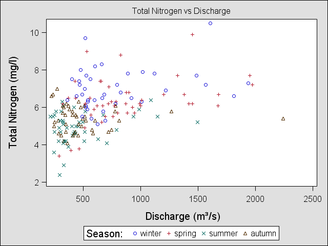
If you want to use your SAS graphs in your publication you will need to adjust text and label. A lot can be done in the procedures like proc sgplot. Below we use again the water data from the example on continuous variables. We also would like to identify different season and use for this a format.
proc format;
value season
3-5 ='spring'
6-8 ='summer'
9-11='autumn'
12='winter'
1-2='winter';
run;
A scatter plot for total nitrogen agains discharge indicating which observations belong to which season:
proc sgplot data=water;
scatter y=ntot x=discharge /group=month;
format month season.;
title 'Total Nitrogen vs discharge';
yaxis label="Total Nitrogen (mg/l)";
xaxis label="Discharge (m3/s)";
run;
Here we wrote (m3/s) instead of (m3/s). To change this is a little cumbersome, since we will need to use UNICODE (http://en.wikipedia.org/wiki/List_of_Unicode_characters) to get it right.
We need to create a new style called unifonts. We will now use Monotype for all labels, data labels, values and titles, we can also define the font size for each of them.
proc template;
define style unifonts;
parent=Styles.default;
style Graphfonts from GraphFonts /
'GraphValueFont' = ("Monotype San WT J",12pt)
'GraphLabelFont' = ("Monotype San WT J",14pt)
'GraphDataFont' = ("Monotype San WT J",12pt)
'GraphTitleFont' = ("Monotype San WT J",12pt);
end;
run;
In the PROC SGPLOT program we must specify that the new style is to be used: style=unifonts, we must also let the program know when the special characters should be used. This we do using and ODS escape character ods escapechar='^'; (here we choose ^, but any character can be used). Then we need to check the Unicode for 3 and we will see it is 00b3. In the label for the x-axis we can now include the Unicode at the right place (first the escape character ^ and then the specification in paranthesis {} ). The graph is created in PNG fileformat.
ods graphics /imagefmt=PNG;
ods listing style=unifonts;
ods escapechar='^';
proc sgplot data=yourdata;
scatter y=ntot x=discharge /group=month;
format month season.;
title 'Total Nitrogen vs Discharge';
yaxis label="Total Nitrogen (mg/l)";
xaxis label="Discharge (m^{unicode '00b3'x}/s)";
label month= "Season:";
run;
ods graphics off;